Contents:
- Creating a report table
- Adding metrics to the report table
- Creating a chart
- Adding a chart to the report
If you wish to enable self-service reporting for your account/tenant, please ask your 6clicks administrator to contact 6clicks support with your name/email, the tenant name, and the provision location (e.g., US, UK, AU) with that request.
This article specifically covers how to add charts to a self-service report. For guidance on how to access and use self-service reporting, please see this article.
Creating a Report Table
To create a chart, you need to first define the data that the chart will reference. If this chart is being added to an existing self-service report you can skip to the next section.
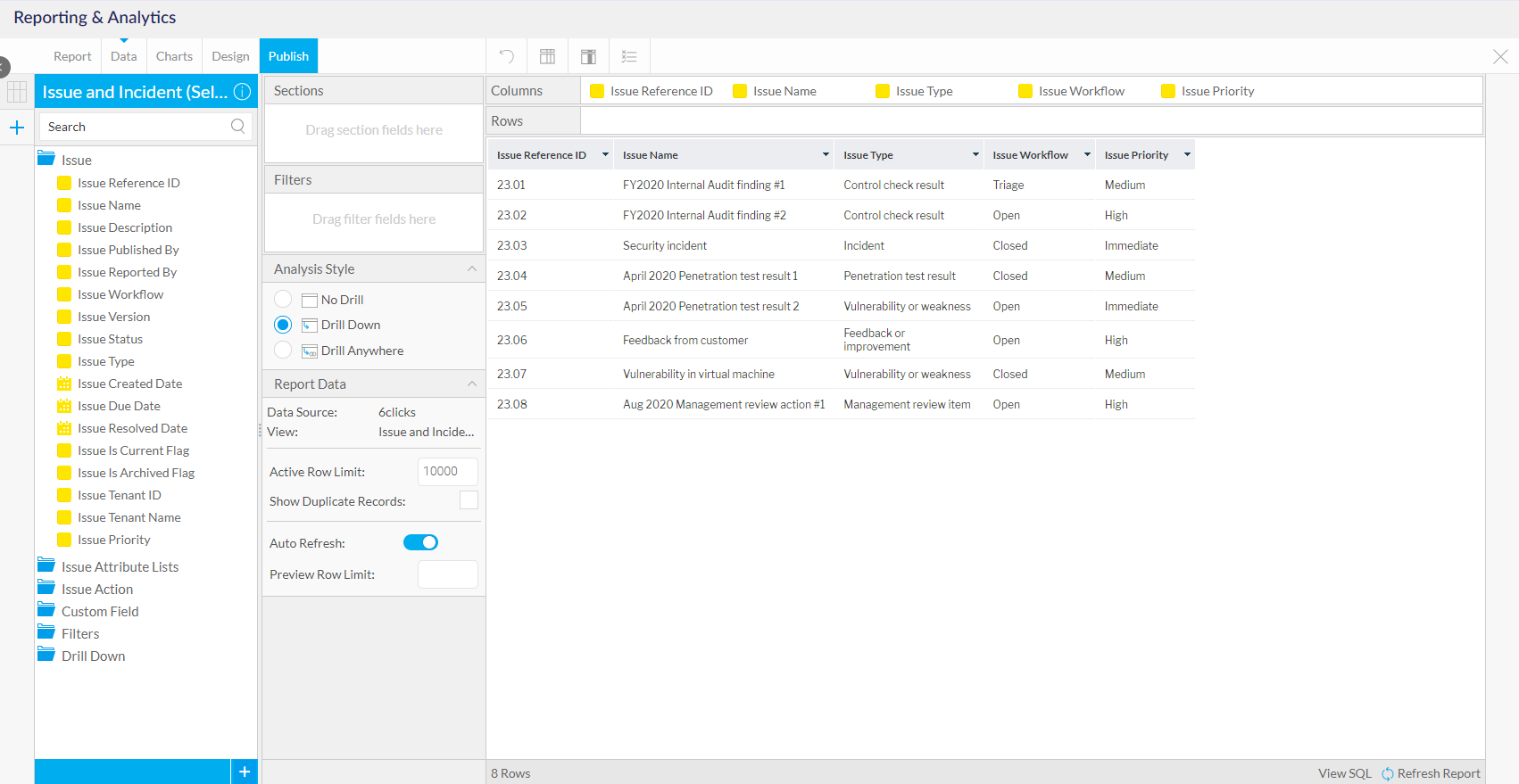
To define the data, select the Data tab and drag and drop the relevant data that you want to visualize. In the below example, the chart will show a breakdown on issues by type, priority, and status.
Adding Metrics to the Report Table
Charts require metrics to be defined within the report. Some self-service views come with pre-defined metrics - however, these can be defined when creating the report.
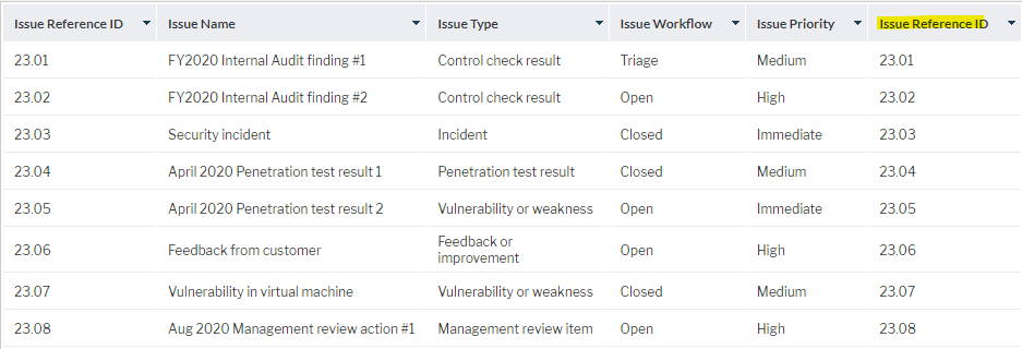
To create a simple metric that counts the number of records, start by dragging the relevant ID field into the report.
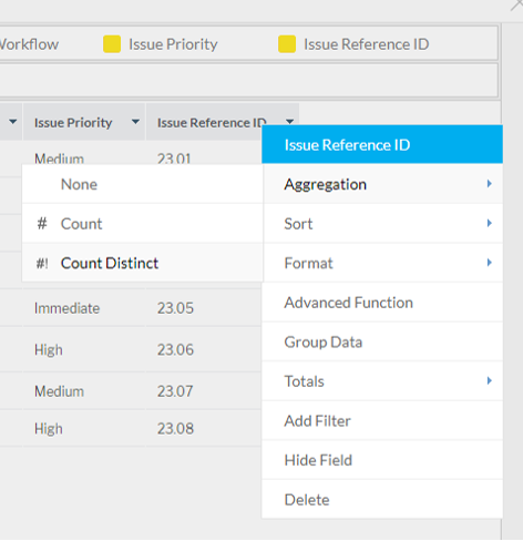
To turn this field into a metric, click the drop-down next to the column name and click Aggregation > Count or Count Distinct.
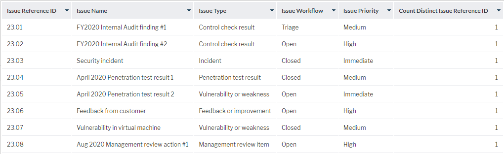
This will turn the field into a metric that can be used when creating charts. You have the option to hide this column should you not wish it to appear in the report table. In the options, select 'Hide this field'. The metric will show in your list of columns but will not show in the report itself.
The above approach can be used for simple metrics. More complex metrics can be defined using calculated fields. Refer to this article for more information.
Creating a Chart
Once the data has been prepared using the steps above, navigate to the Charts tab.
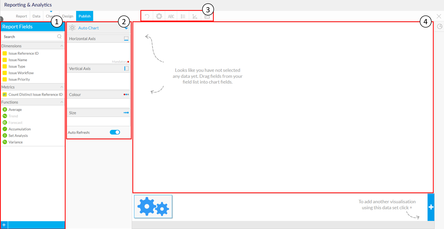
- Available report fields for the chart(s)
- Chart configuration settings
- Chart formatting settings
- Chart preview
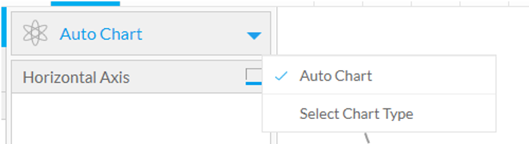
Select the chart you want to build by clicking Select Chart Type in the drop-down at the top of the chart configuration area.
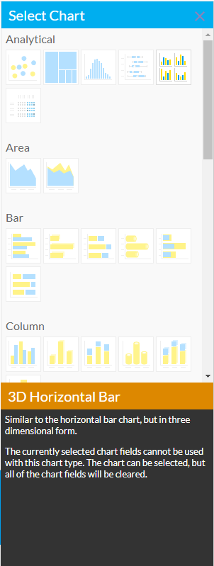
This will open a modal from which you can select the desired chart type. If you hover over each image, you will see a description of the type of chart that will be used with that selection.
From here, you can drag and drop the relevant report fields into the chart configuration area to start creating the chart.
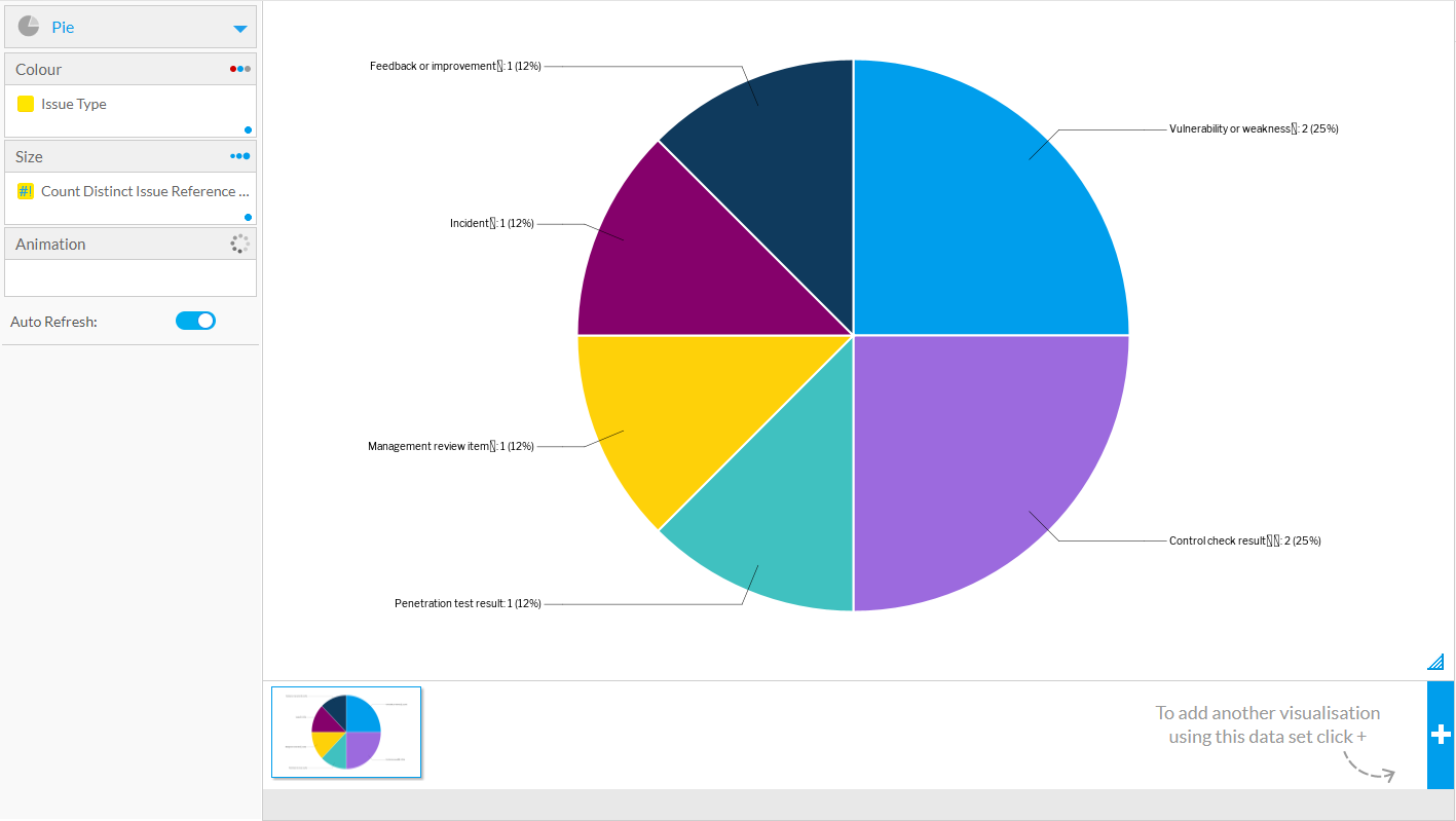
Use the chart formatting options at the top of the page to refine the chart. This includes setting the chart title, style, legend, and more.
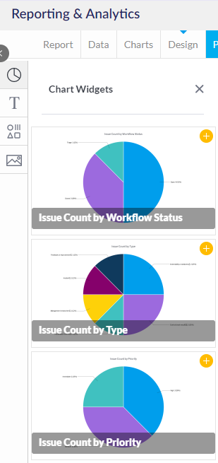
Additional charts can be added via the + button at the bottom right of the screen.

Adding a Chart to the Report
Once you have created the required charts, navigate to the Design tab to add these to the report. If you have created the chart within a self-service report, the chart will be visible in draft mode in the report and can be saved to the report at this time or after you make any additional modifications.
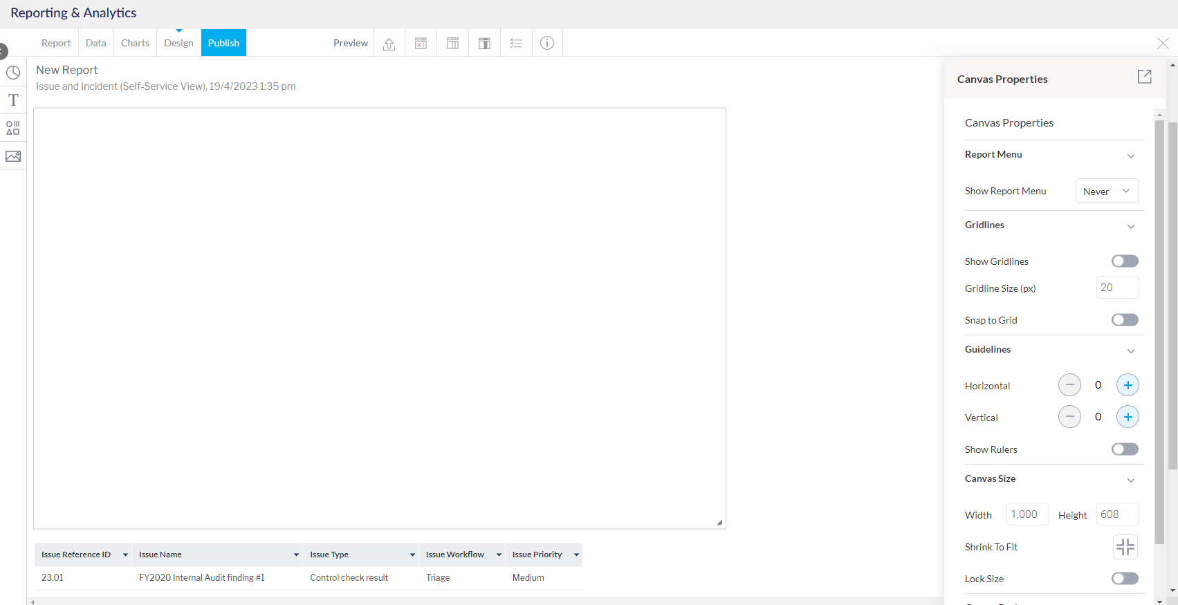
Charts are added to the report canvas. This can be configured (including its size) via the Canvas Properties popup on the right-hand side.
Click the Chart icon on the left-hand side to view then drag and drop to add the charts to the canvas.
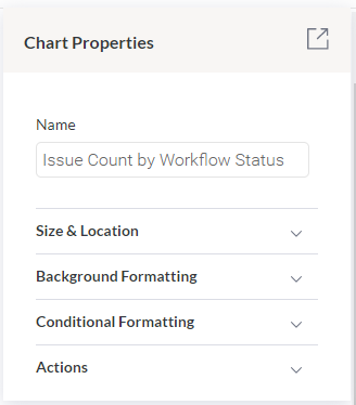
When added, charts can be moved and then configured as desired within the canvas. Clicking on a chart will open the Chart Properties settings on the right-hand side popup.
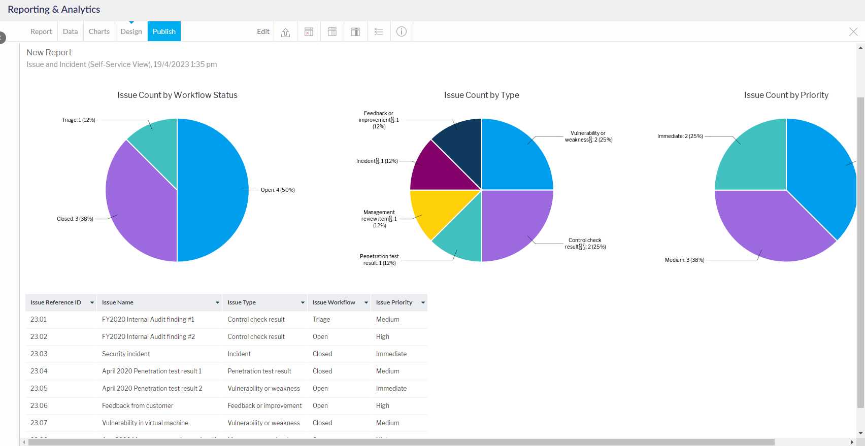
The report table can be hidden via a button in the report formatting settings at the top of the screen.
Now you can publish and share your chart(s). For more information on how to further configure and then publish and share the report, click here.
Charts that you have created via Self-Service Reporting can also be added to Dashboards, Presentations or Stories.
For more information on how to create a Dashboard, click here. For more information on how to create a Presentation or Story, click here.